Technical Analysis: A Complete Beginner’s Guide to Master Price Action
Technical Analysis: A Complete Beginner’s Guide to Master Price Action
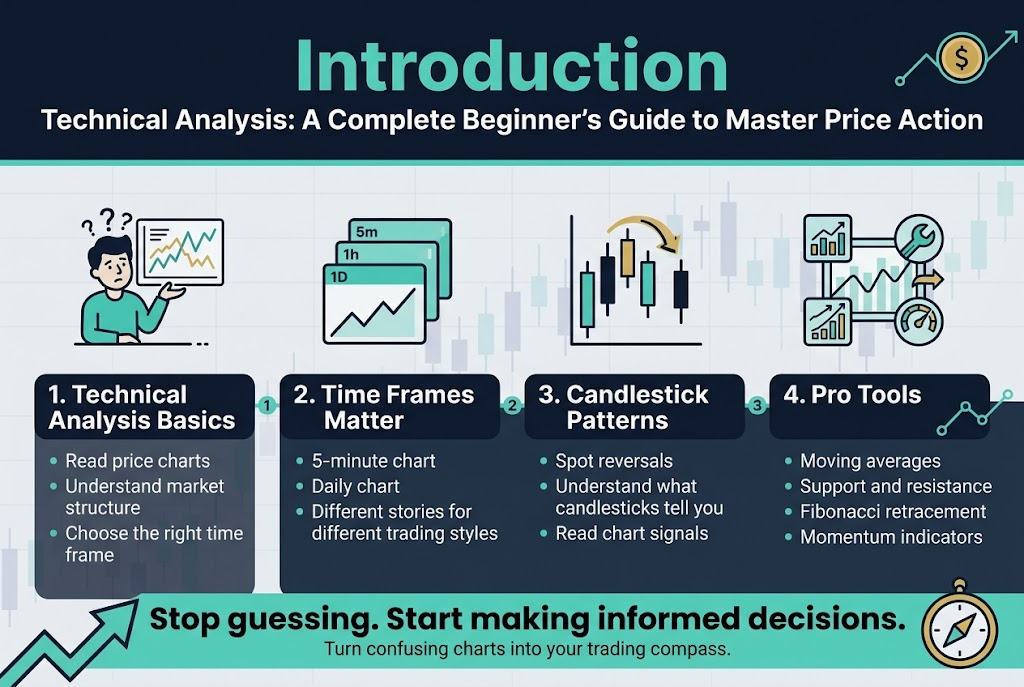
New to trading and confused by all those squiggly lines on price charts? You’re not alone. Technical analysis beginner guide content can feel overwhelming, but it doesn’t have to be rocket science.
This guide is for anyone who wants to read charts like a pro – whether you’re a complete newbie who’s never placed a trade or someone who’s been winging it and wants to get serious about price action trading. You’ll learn to spot patterns, time your entries, and actually understand what those candlesticks are trying to tell you.
We’ll start with the technical analysis fundamentals that every trader needs – like how to choose the right time frames for your trading style and why a 5-minute chart tells a completely different story than a daily one. Then we’ll dive into candlestick patterns and chart reading basics, showing you how to spot market reversals before they happen. Finally, you’ll master the tools that pros use daily: moving averages trading, support and resistance levels, fibonacci retracement, and momentum indicators that reveal market strength.
By the end, you’ll stop guessing and start making informed decisions based on what the market is actually showing you. Ready to turn those confusing charts into your trading compass?
Understanding Technical Analysis Fundamentals
What Technical Analysis Is and How It Predicts Price Movement
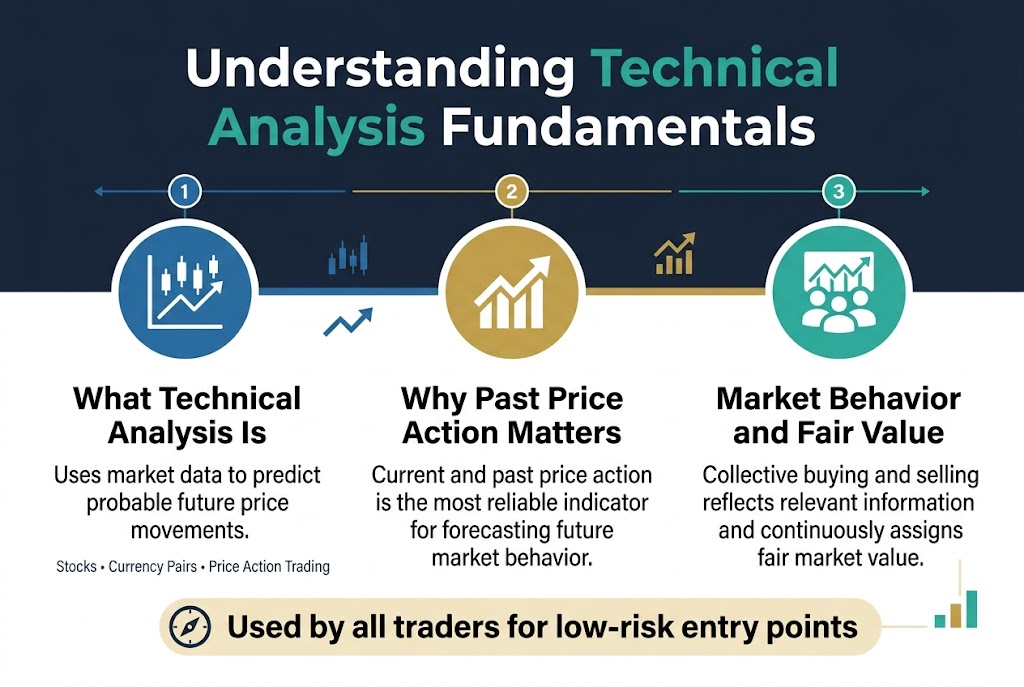
Technical analysis fundamentals form the cornerstone of successful price action trading. This method uses market data to predict probable future price movements of securities like stocks or currency pairs. Technical traders rely on current and past price action as the most reliable indicator for forecasting future market behavior, making it an essential tool for chart reading basics.
Why Past Price Action Indicates Future Performance
The theory behind technical analysis fundamentals states that collective market actions of all participants accurately reflect relevant information for traded securities. This creates a continuous fair market value assignment through buying and selling activities. Even fundamental traders utilize technical analysis to identify optimal, low-risk entry points after deciding to enter specific markets.
Choosing the Right Time Frames for Your Trading Style
Popular Time Frame Options from Minutes to Monthly Charts
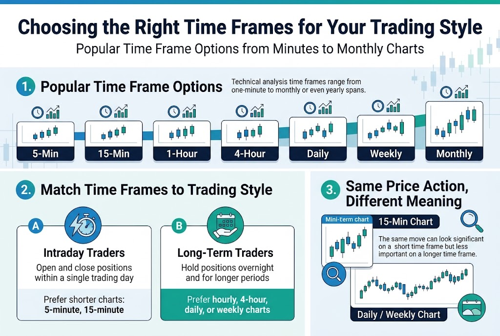
Technical analysis time frames on charts range from one-minute to monthly or even yearly spans. Popular trading time frames frequently examined by technical analysts include 5-minute, 15-minute, hourly, 4-hour, and daily charts, each serving different analytical purposes.
Matching Time Frames to Intraday vs Long-Term Trading Strategies
The time frame a trader chooses is determined by their personal trading style. Intra-day traders, who open and close positions within a single trading day, prefer shorter time frame charts like 5-minute or 15-minute charts. Long-term traders, who hold positions overnight and for longer periods, are more inclined to analyze markets using hourly, 4-hour, daily, or even weekly charts.
How Same Price Action Appears Different Across Time Frames
The same price movement can appear very significant for an intra-day trader on a shorter time frame like 15-minute charts but may not be particularly significant for long-term trading purposes when viewed on daily or weekly charts.
Mastering Candlestick Chart Reading
How Candlesticks Form and Display Price Action
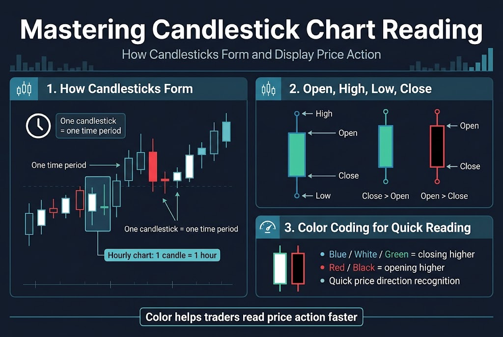
Candlestick charting represents the most commonly used method to display price movement on charts, with each candlestick formed from price action during a single time period for any given time frame. For instance, each candlestick on an hourly chart shows complete price action for one hour, capturing all trading activity within that period.
Reading Opening, Closing, High and Low Prices from Candlestick Bodies
The highest point of a candlestick indicates the highest price a security traded during that time period, while the lowest point shows the lowest price. The candlestick “body” displays opening and closing prices, where blue (or white/green) bodies indicate closing prices higher than opening prices, and red (or black) bodies show opening prices higher than closing prices.
Understanding Color Coding for Quick Price Direction Recognition
Candlestick colors provide immediate visual cues for price direction recognition in chart reading basics. While color schemes are arbitrary, they offer traders quick determination of whether prices closed higher or lower at the end of any given time period, making price action trading analysis more efficient and accessible for technical analysis practitioners.
Identifying Market Reversals with Candlestick Patterns
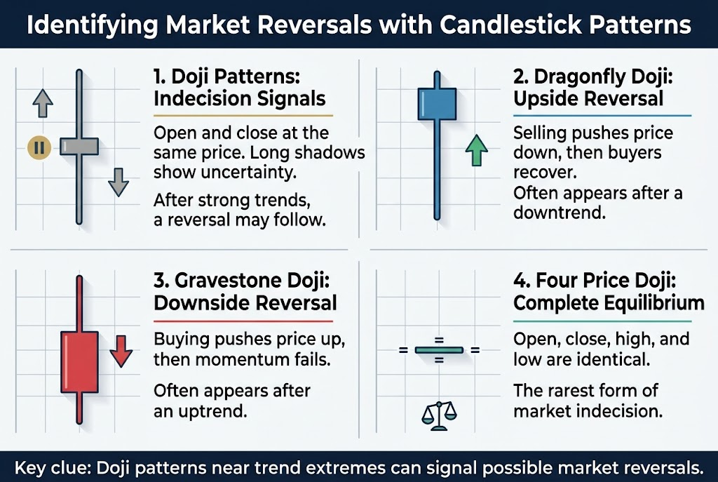
Recognizing Doji Patterns as Indecision Signals
Doji candlesticks represent powerful indicators of market indecision, characterized by their unique feature where opening and closing prices are identical, creating a flat-line body. These candlestick patterns signal potential trend changes when longer upper and lower shadows extend from the body, indicating stronger market uncertainty and possible reversal signals.
The long-legged doji demonstrates this indecision most clearly, with prices extending equally in both directions before settling at the middle range. When these patterns appear after extended uptrends or downtrends, they commonly signal impending market reversals, making them essential tools for price action trading analysis.
Using Dragonfly Doji to Spot Upside Reversals
The Dragonfly Doji serves as a crucial reversal pattern when appearing after prolonged downtrends. This formation occurs when sellers initially push prices substantially lower, but buyers regain control, driving the price back to close at its highest point for the period.
Interpreting Gravestone Doji for Potential Downside Moves
The Gravestone Doji represents the opposite scenario of the Dragonfly, indicating strong rejection of upward price movements. This pattern suggests potential downside reversals when buyers attempt to push prices higher but fail to maintain momentum.
Understanding Rare Four Price Doji Formations
The Four Price Doji represents the rarest form of market indecision, occurring when opening, closing, high, and low prices remain identical throughout the entire trading period. This extraordinary pattern demonstrates complete market equilibrium with absolutely no directional bias or movement inclination.
Using Moving Averages for Trend Following
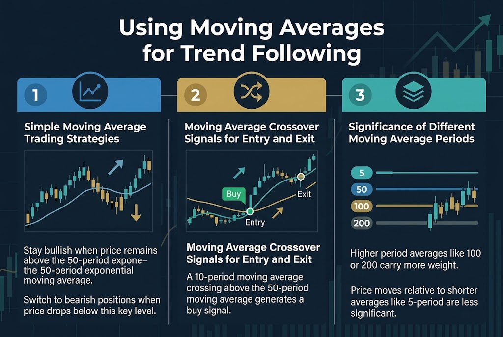
Simple Moving Average Trading Strategies
Moving averages are the single most widely used technical indicator in trading strategies. A straightforward approach involves maintaining a bullish position when price stays above a 50-period exponential moving average and switching to bearish positions when price drops below this key level.
Moving Average Crossover Signals for Entry and Exit
Moving average crossovers provide frequent entry and exit opportunities for traders following trend-based strategies. A common crossover signal occurs when a 10-period moving average crosses above the 50-period moving average, generating a buy signal for trend following positions.
Significance of Different Moving Average Periods
The period length significantly impacts a moving average’s importance in technical analysis. Higher period moving averages like 100 or 200 periods carry more weight, making price movements relative to them more significant compared to shorter period averages such as 5-period moving averages.
Finding Support and Resistance with Pivot Points
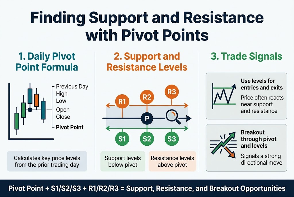
How Daily Pivot Points Identify Key Price Levels
Daily pivot points serve as essential tools for identifying critical support and resistance levels in price action trading. These indicators are calculated using the previous trading day’s high, low, opening, and closing prices, providing traders with predetermined price levels where significant market reactions often occur. Most pivot point indicators display the daily pivot point alongside three support levels below and three resistance levels above it, creating a comprehensive framework for analyzing potential price movements.
Using Support and Resistance Levels for Trade Entry
Many traders utilize daily pivot point indicators to determine optimal price levels for entering or closing out trades. These pivot point levels frequently mark significant boundaries where trading becomes contained within a specific range, making them valuable reference points for technical analysis fundamentals. The calculated support and resistance levels act as natural price magnets, where traders can anticipate potential reversals or continuation patterns, enhancing their ability to time market entries with greater precision.
Recognizing Breakout Trading Opportunities
When trading breaks significantly through the daily pivot and all associated support or resistance levels, this movement is interpreted as breakout trading, suggesting substantial price shifts in the direction of the breakout. These breakout scenarios represent powerful trading opportunities where price action moves beyond established boundaries, often leading to sustained trends and significant profit potential for traders who can identify and capitalize on these decisive market movements.
Applying Fibonacci Analysis for Strategic Entry and Exit
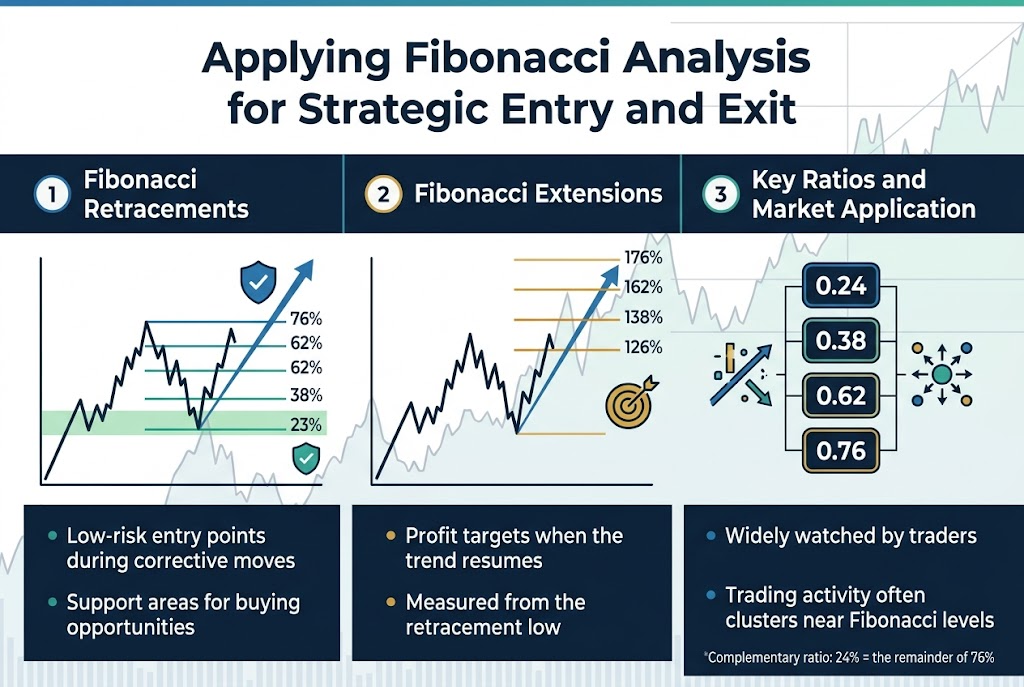
Using Fibonacci Retracements to Find Low-Risk Entry Points
Fibonacci retracements serve as the most commonly used Fibonacci indicator for identifying strategic entry opportunities during corrective price movements. These retracements help traders pinpoint low-risk entry points when prices temporarily move against a sustained trend before resuming their overall direction. For instance, when a stock climbs and subsequently falls back, fibonacci retracement levels at 23%, 38%, 62%, and 76% suggest probable support areas where investors might consider buying opportunities.
Calculating Fibonacci Extension Levels for Profit Targets
Fibonacci extensions provide crucial insight for determining profit targets when trends resume after retracements. These extension levels are calculated at 126%, 138%, 162%, and 176% of the original uptrend move, measured from the retracement low. This technical analysis tool helps traders establish realistic profit objectives by indicating how much higher prices may extend during trend continuation phases.
Key Fibonacci Ratios and Their Market Applications
The primary fibonacci ratios include 0.24 (23%), 0.38 (38%), 0.62 (62%), and 0.76 (76%), where complementary ratios exist (24% represents the remainder of 76%). Due to widespread adoption among traders, significant trading activity frequently occurs around these fibonacci levels, making them valuable reference points for predicting probable future price movements and market behavior.
Measuring Market Strength with Momentum Indicators
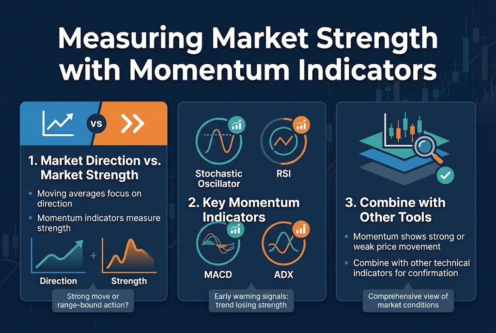
Distinguishing Between Market Direction and Market Strength
Unlike moving averages and most other technical indicators that focus on market direction, momentum indicators’ main purpose is to determine market strength. By measuring the strength of price movement, momentum indicators help investors determine whether current price action represents insignificant, range-bound trading or an actual, significant trend.
Using Stochastic, RSI, MACD and ADX Indicators
Popular momentum indicators include the Stochastic Oscillator, Relative Strength Index (RSI), Moving Average Convergence-Divergence (MACD) indicator, and the Average Directional Movement Index (ADX). These momentum indicators can serve as early warning signals that a trend is coming to an end by showing a trend steadily losing strength.
Combining Momentum Indicators with Other Technical Tools
As momentum indicators generally only signal strong or weak price movement, but not trend direction, they are often combined with other technical analysis indicators as part of an overall trading strategy. This combination approach helps create a more comprehensive view of market conditions when analyzing price action trading opportunities.
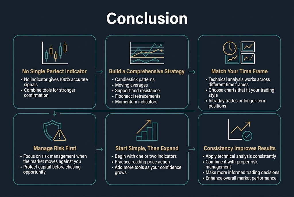
Mastering technical analysis requires understanding that no single indicator provides 100% accurate signals all the time. The most successful traders combine multiple tools from this guide – candlestick patterns, moving averages, support and resistance levels, Fibonacci retracements, and momentum indicators – to build a comprehensive trading strategy. Remember that technical analysis works across different time frames, so choose the charts that align with your trading style, whether you’re making intraday trades or holding positions for longer periods.
The key to profitable trading lies not just in identifying opportunities, but in managing risk when the market moves against you. Start by practicing with one or two indicators until you become comfortable reading price action, then gradually incorporate additional tools as your confidence grows. Technical analysis, when applied consistently and combined with proper risk management, can significantly improve your ability to make informed trading decisions and enhance your overall market performance.